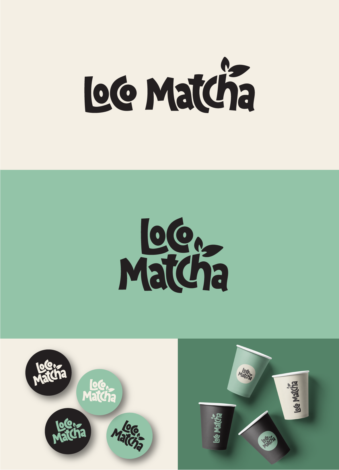
Logo concept for surfer matcha bar
17
Kreiert mit 99designs von Vista
The contest holder was looking for something relaxed and friendly to attract passing customers.
As this design was to be used on food packaging, I kept it quite simple so that it would easily scale.
The typography has been customised to give a playful and friendly vibe to the design, creating lots of movement.
The green colour palette is synonymous with matcha and so adds to storytelling of the logo.
