Bold and colourful concept for softcrew

1
Kreiert mit 99designs von Vista
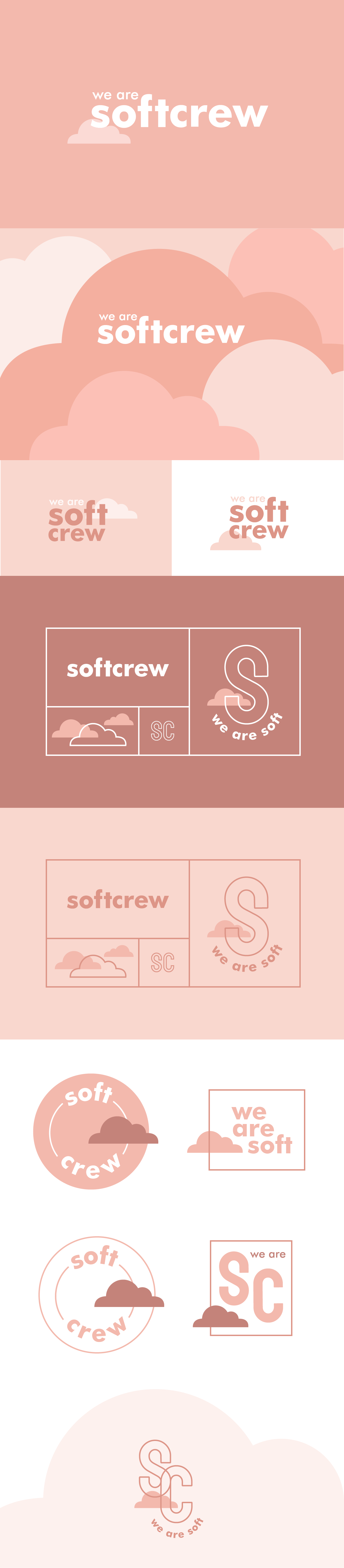
I wanted to find an icon that would express the feeling of being soft, while at the same time reflecting the idea of being outside. The brand doesn’t need to be obvious, it can bring you a feeling of being soft through the colours, and keeping it simple with a bold lowercase typography. It is creative and playful - the logo has several applications that I had lots of fun coming up with. And the cloud icon brings a lot of personality, being able to sit in different spaces as the logo transforms into different versions, or even expanding and becoming areas of colour in the background.