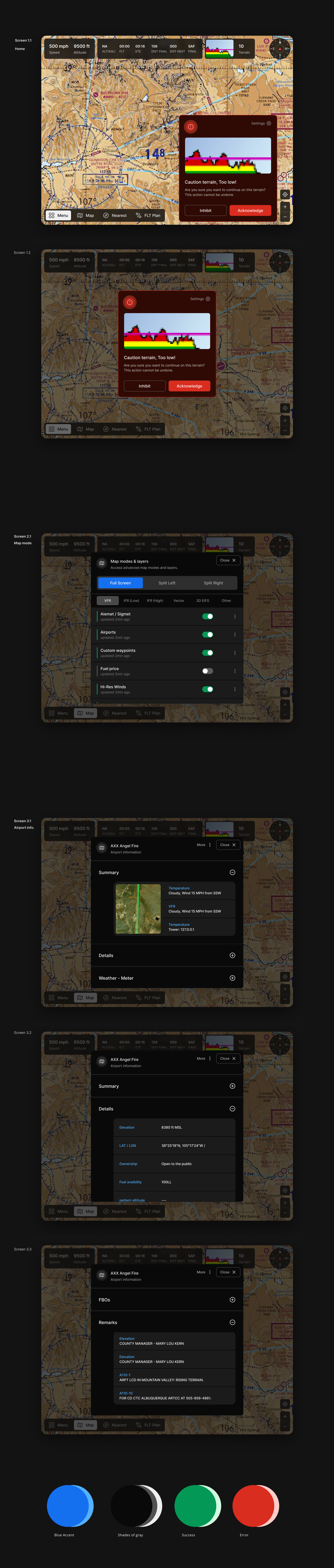
iFly GPS aviation navigation app UI/UX

1
Kreiert mit 99designs von Vista
Client wanted the redesign with improved legibility and contrast for the app, which will be used in-flight in small airplanes, so user might be bouncing around in turbulence and in bright sunlight.
Goals:
Clean and intuitive interface (Less possible distractions, contrasts on the right thing first)
Users can make informed decisions based on the UI.
Fully responsive layout with landscape and portrait modes.
Have larger possible space for maps (So it's easier for navigation on smaller devices also)