Powerpoint Template for AQ Dogsport

14
Kreiert mit 99designs von Vista
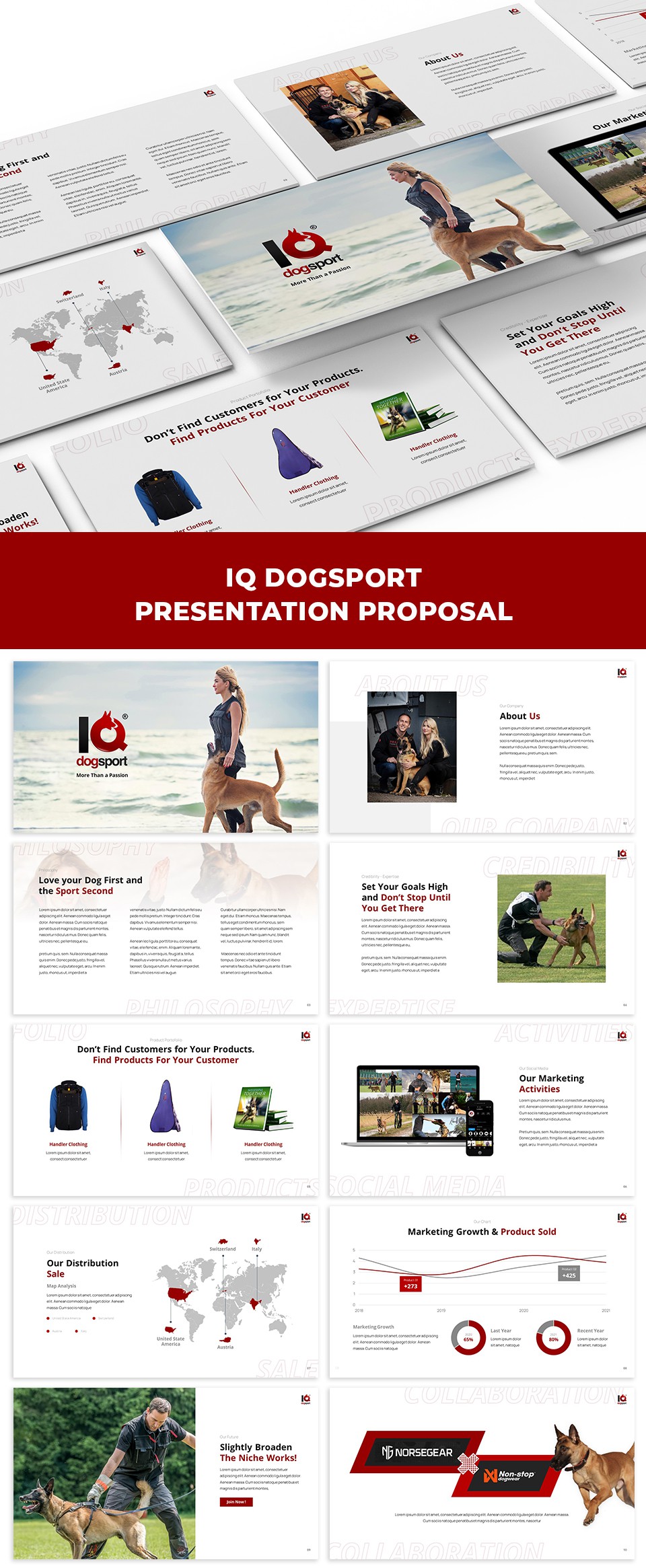
For this project I have received a lot of feedback and a fun process. The client doesn't want too much red & black color. They also have lots of pictures as assets. This presentation relies on the use of images to convey its message to the audience.
From this brief description and advice, I tried to put red and black in a minimalist way, so as not to distract the audience, and chose an image that represents the meaning/purpose/message to the audience.