Logo Concept Design "Meraki"

1
Kreiert mit 99designs von Vista
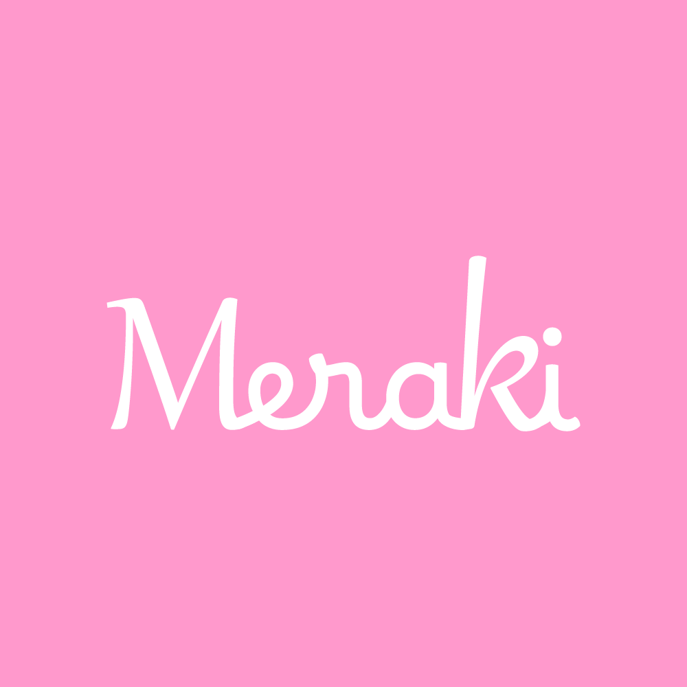
Meraki, halfway between Classic and Modern, the font changes were exactly with this context in mind, the initial 'M' brings a more classic air to the brand and includes all its elegance, while 'ERAKI' includes modernity and brand diversity, modernization, fashion.
With this brand applied you will have Luxury and Sophistication, but also a brand that absorbs all modern qualities, without excluding any thought out concept.
As we know, Pink is a very predominant color in fashion and in many other areas, but in this brand it will be a perfect application of the concept of tenderness, timeless elegance, delicacy and sensitivity.